How to read stock charts and trading patterns

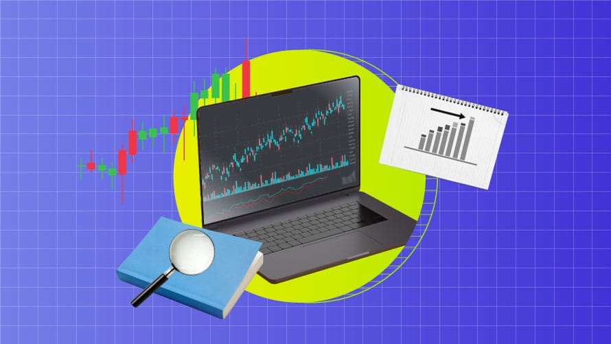
Timing the market, they say, is a fool’s errand. Yet, chartists or technical analysts swear that making and interpreting charts can help understand stock movement. At first glance, stock charts look like a disorganized collection of lines, numbers, and words. Yet, a closer look at the data can teach you a thing or two about a stock’s historical performance and also help you decipher where it is headed. Thus, understanding how to read trading charts can help you immensely in your trading decisions. Let’s learn more about the nuances of charts and trading patterns.
Types of trading charts and how to analyze them
For technical traders, charts are the mirrors to view the market. Traders can see a huge range of market data, thanks to the many improvements made to research tools. There is a lot of information out there, so it’s important to make charts that will help your market analysis instead of getting in the way of it. Here’s how to understand trading charts.
Three types of stock charts
Price charts show the buying action that happens during a certain period, like five minutes, thirty minutes, a day, etc. In general, each time is made up of several data points, such as the price at the beginning, the price at the end, the high point, and the low point. Mostly, traders use at least one of the three types of stock charts:
Line chart
If you think of a chart, the first thing that might come to mind is a line chart. Along the Y-axis, which is the stock price or trading volume, is the period, and across the X-axis is the price or trading volume. Trading statistics show how many shares of a company were bought and sold on the market on a certain day. A line chart is usually made from the stock price at the end of the day.
To make a line chart, you pick a date and draw the stock price on the line at the end of the day on that date. To do this, you will place a dot on the map above the date in question and next to the stock price that goes with it. Therefore, it’s important to understand how to read trading charts.
Bar chart
There are similarities between a line chart and a bar chart. However, it is much more useful. Not a dot, but a vertical line with two horizontal lines sticking out of each side of it makes up each mark on a bar chart. The higher the point on each straight line, the higher the price of the stock during the day. The lower the point on each line, the lower the price during the day.
The straight line on the rightmost side shows the price at which the stock began trading. The price at the end of the trading day is shown by the one on the right. This means that each bar on a chart gives you four things. A bar chart is better than a line chart because it shows both prices and how much they change over time.
Candlestick chart
Both bar charts and candlestick charts show the same things. A bar chart is made up of different straight lines. A candlestick chart, on the other hand, is made up of squares with lines going out of both sides of them. The biggest price that day is shown by the line at the top.
The line at the bottom shows the lowest price that day. Inside-day charts can show the trade for the day. The top and bottom of the block, which is called the “body,” show the day’s starting and ending prices. The taller one is at the top of the body, and the shorter one is at the bottom.
Bar charts vs. candlestick charts
When looking at the starting price of a period, the bar chart puts the ending price of the previous period above the real beginning price of that period. The starting price of a certain time is used by the candlestick chart, on the other hand. The change is small as the beginning price of one time is usually the same as the ending price of the previous one.
You can find more trends in candlestick charts than in bar charts when you trade online. Bar charts can, of course, be used to show trends. Traders like candlestick charts more because of the designs.
A bar chart might help you get a better idea of where to put trend lines and zones on the chart. On the other hand, candlesticks have bigger bodies that take up more room and make it harder to be precise. The difference may not be much, but some experienced traders think that understanding how to read trading charts has helped them make better decisions when they trade online.
Stock chart patterns for traders
A chart pattern is a set pattern of price changes that happen over and over. Chart pattern analysis is based on the idea that you can guess what might occur when a pattern shows up again if you know what happened in the past. Still, past success is rarely an indication of what will happen in the future. What happens with each chart pattern depends on whether it shows up in markets that are chaotic or calm and whether the market is positive or bearish.
Spotting trends, support, and resistance
Trends show how fast the stock is moving right now. When a trend is going up, it means that the value of the stock is going up. A falling trend, on the other hand, means that stock prices are going down. If the trend is straight or sideways, it means that the cost of the stock stays about the same, with no big changes. That is why it is very important to know how to read charts in trading.
When demand is high enough, the stock can’t go down any further. This is called support. The price has a hard time breaking through the support level every time it hits it. The idea behind this is that as the price falls and gets closer to support, buyers (demand) are more likely to buy, and sellers (supply) are less likely to sell.
When supply is strong enough, the stock can’t go up, which is called resistance. This means that the price has a hard time going up every time it hits the limit level. The idea behind this is that as the price goes up and gets closer to resistance, sellers (supply) want to sell more, and buyers (demand) want to buy less.
Reversals and breakout patterns
When a trend ends, reverse patterns appear to show that the trend will start again. When the price breaks out of these patterns and goes in the opposite direction, it confirms that the trend has finally changed direction. There are a lot of important bearish turnaround patterns, such as the head and shoulders, the double top, the rising wedge, and more. Usually, these trends mean that the price of the product is about to go down and that it may no longer be going up. The shape shows that selling pressure is rising and that the rise will soon end.
A technical analysis breakout happens when the price of an object goes above or below a support or barrier area. A lot of the time, breakout patterns are linked to bands or other chart patterns. Shapes like circles, wedges, head and shoulders, flags, and more are included. Breakout patterns can turn short setups into long ones if the price breaks above the support. If the price falls below support, breakout patterns can be used to start short positions or get out of long positions. Trading professionals can make more money by learning how to read stock market charts and breakout patterns.
Common price patterns
There are two types of price patterns: reversal and continuation. If the price breaks out of the pattern and the direction changes, it is called a reverse pattern. A price pattern is also called a continuation pattern if the breakout of the pattern leads to a continuation in the trend.
Multiple sources
Different indicators will sometimes give you wrong information, which could lead you to make bad trades and lose money. A foolproof method uses more than one sign to back each other up. If different signs give traders different messages, they are less likely to make moves that could be bad for them. Learn how price movement, volume, and moving averages work together, and then add or remove signs as you devise your method.
Volume and moving averages work in tandem with prices
A good example of a daily chart uses price movement, moving averages, support and resistance levels, multiple markers, and basic breakout patterns. The dark lines show how traders might find levels of support and resistance. It shows the volume below the chart and has two moving averages (10-day and 30-day) drawn over the candles inside the chart. Keep an eye on the crossing between the two moving averages. This could mean that momentum has changed from positive to negative or the other way round.
Conclusion
Traders can use a wide range of price charts, indicators, and strategies to help them find their way around the markets. It is important to have an understanding of how to read trading charts. If you want to make good decisions with charts, you should find the right balance between having the right amount of information on them and having too much information that makes you unable to decide.
You can make a wrong decision when there are too few signals—analysis paralysis—or when there are too many and no trade signal is given. When you first start reading stock charts, keep things simple. Every trader has a different way of finding the best mix. That’s why it’s important to start with the basics and use the trends and signs that make sense to you.
Disclaimer
The stocks mentioned in this article are not recommendations. Please conduct your own research and due diligence before investing. Investment in securities market are subject to market risks, read all the related documents carefully before investing. Please read the Risk Disclosure documents carefully before investing in Equity Shares, Derivatives, Mutual fund, and/or other instruments traded on the Stock Exchanges. As investments are subject to market risks and price fluctuation risk, there is no assurance or guarantee that the investment objectives shall be achieved. Lemonn (Formerly known as NU Investors Technologies Pvt. Ltd) do not guarantee any assured returns on any investments. Past performance of securities/instruments is not indicative of their future performance.


